- Liqueur
Packaging refers to a broad range of actions to develop a package design and generate an acceptable and appealing container or wrapping for a product. We created the "Open Sails" concept as the product name and depicted the sails so as to resemble the characteristic patterns that can be seen in Chios island - the origin of this liqueur.
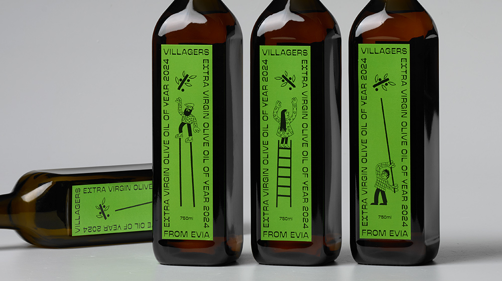
- Extra virgin olive oil
In a complex marketing strategy, illustrations can help position a product on the market and make it stand out. We used illustrations of villagers as the tool for building and reinforcing the brand's personality and values and together with the distinctive typography we conveyed the product's message like a brand's signature—distinct and recognisable.
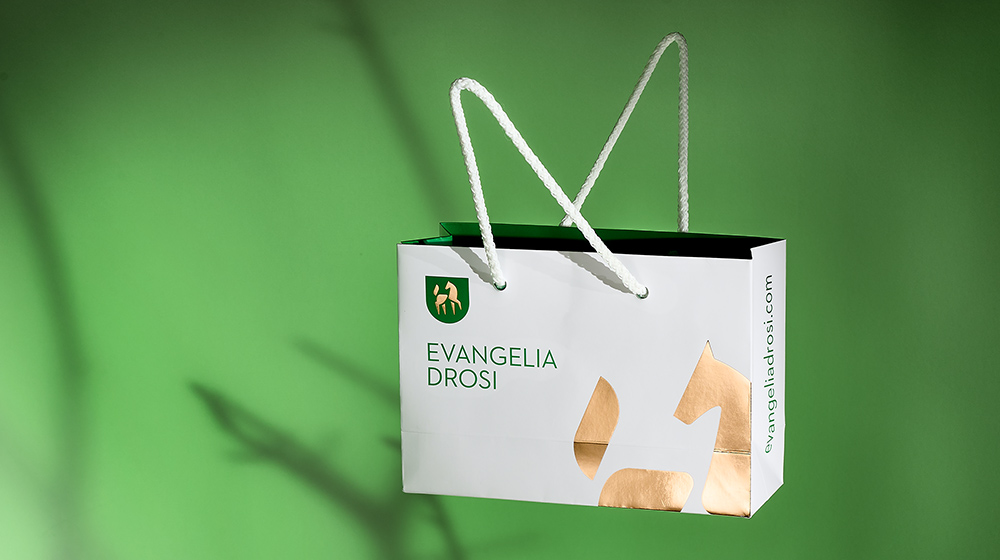
- Shoe company
Brand identity for Evangelia Drosi - handmade shoes and accessories company based in Athens.
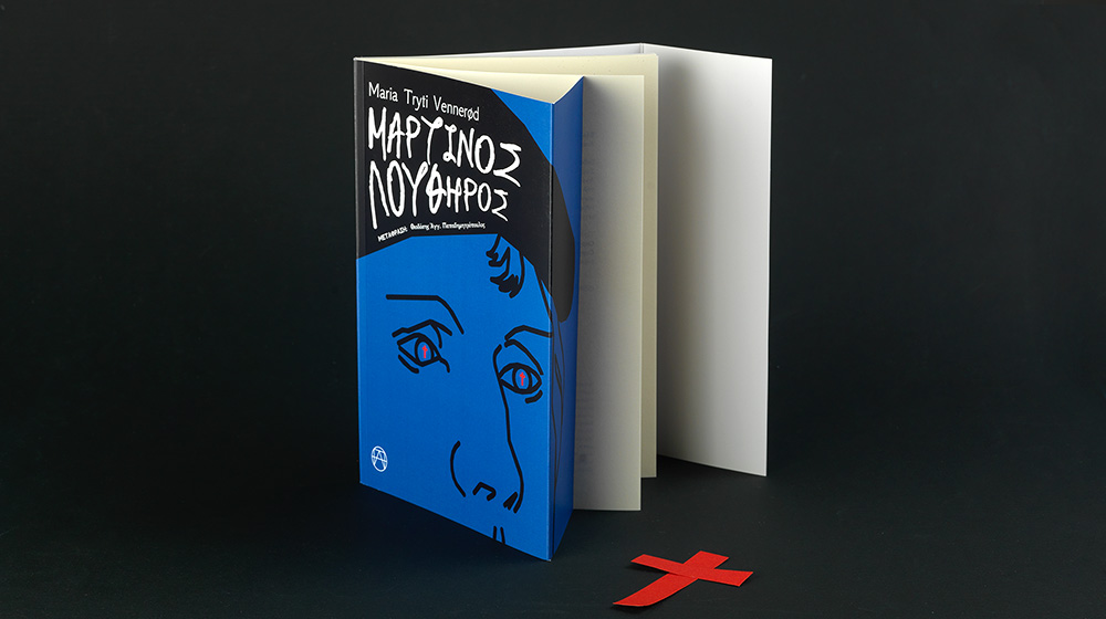
- Book cover

Cover design for Martin Luther. The poetic drama Martin Luther (2017) by the modern Norwegian playwright Maria Tryti Vennerød, is first translated and first published in Greek by Theodosis Ang. Papadimitropoulos.
"Before modern medicine, before antibiotics, toilets and cod liver oil, towels, paracetamol and the age of the plague. People were dying everywhere and death was everywhere ..."
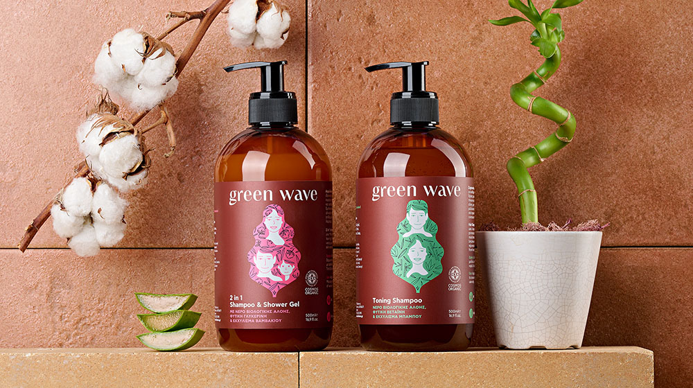
- Shampoo
Organic hair and body care series from bioLEON, certified by the ICEA organization with herbs and oils with properties suitable for the care, hydration and stimulation of hair and body.
"Green" from nature leaves and "wave" from water are combined to create the name of the product. The illustration depicts the leaf as a wave that showers the family with the natural ingredients of the product. A compelling brand story through packaging, focusing on emotional and intellectual engagement with customers.
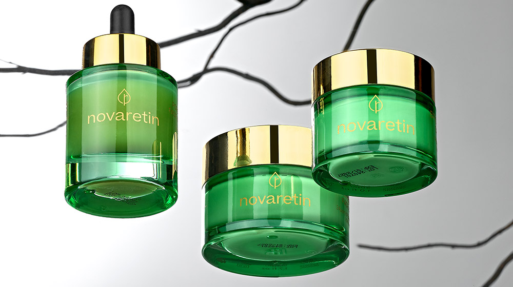
- Cosmetics packaging
The unique NovoRetin™ ingredient is based on mastic, an aromatic resin that comes from a tree that grows exclusively on the Greek island of Chios. NovoRetin™ serves as an ideal alternative to plant-based retinol, providing both powerful anti-aging effects and excellent benefits for acne-prone skin.
Clients seek designs that not only look good but also resonate emotionally with their target audience. Novaretin's brand and packaging is designed in such a way in order to connect with customer values and create a sense of luxury and comfort. Key words: resin, tree, organic, nature.
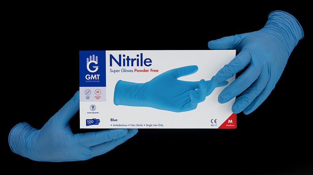
- Gloves packaging
Packaging design and rebranding for GMT gloves.
We were assigned by GMT super gloves for a holistic rebranding process. New Logo, Identity, and most of all, a new packaging system were designed and applied to 50 packages of different products, colors and sizes.
A group of top manufacturers of gloves in Asia created GMT to support the increasing needs of their clients all over the world in the most efficient way. Powder-free or powdered, GMT Super Gloves meet the strictest international standards and are suitable for a wide range of uses.
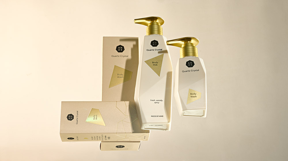
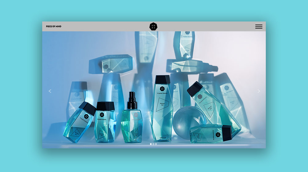
- Cosmetics packaging
ANAS from the Netherlands is the first patented line of cosmetics that uses the powerful properties of crystals by placing a whole piece of natural and refined Crystal Quartz in the heart of its volcanic water based formulas.
We designed a series of packages that have as key ingredient the "crystal", its shape and its characteristics. Our strategy was to invest in every way in the concept of crystal. The uneven shape has led us to think that the packaging itself should be like a crystal for easy recognition by the consumer. Crystal is made up of many small pieces so we visualize each product in the series as a crystalline shape and when all the products come together they create the ANAS logo.
- Cosmetics packaging
Powerhealth, one of the largest vitamin companies in Greece produces its first skincare series along with 25A Lab in Crete. Collecting herbal extracts and fruits from the land of the famous Crete island, Powerhealth uses “Nature’s Innovation” in the new products.
Our name proposal was “Inalia”, one of Aphrodite's names - the goddess of beauty - in ancient Greece. The topography and the altitude difference of the fertile soil of Crete were the inspiration for the creation of the series' visual mechanism. Concentrated shapes and curves demonstrate the altitude difference and also the way Nature's Innovation spreads to the skin. The interaction of science and nature is reflected in the bottle itself, where the outer rectangular part interacts with the inner cylindrical container. The internal cylinder spins when you rotate the lid …and the essence and the secrets of Nature's Innovation are released.
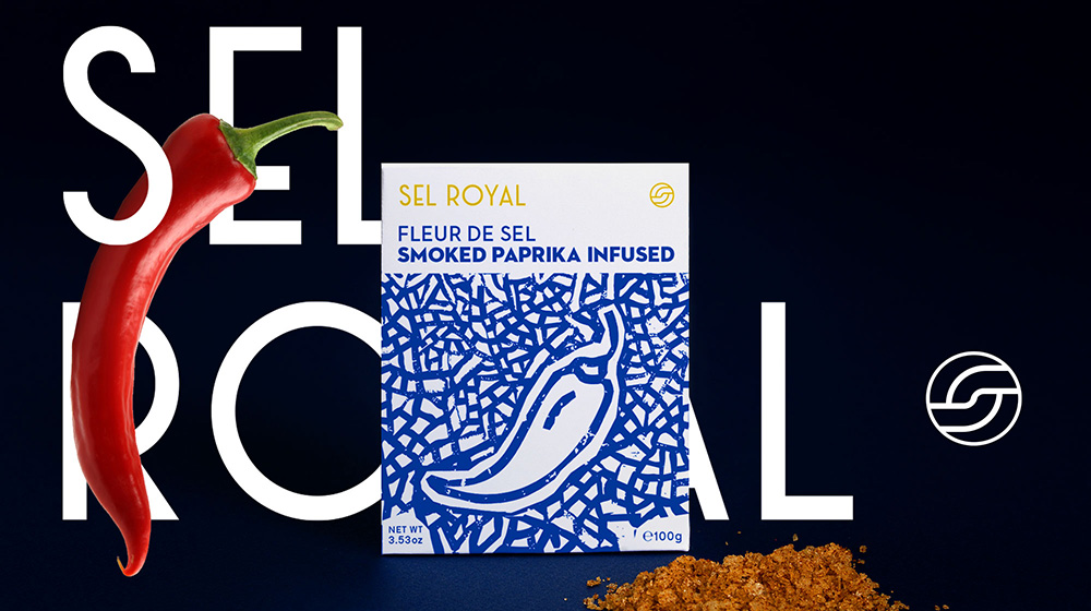
- Packaging
Branding for Sel Royal - Salt, natural infused with flavours. We designed an illustration system which defines and characterizes the graphic design of the packaging, giving a strong personality to the product and strengthening the corporate identity at the same time.
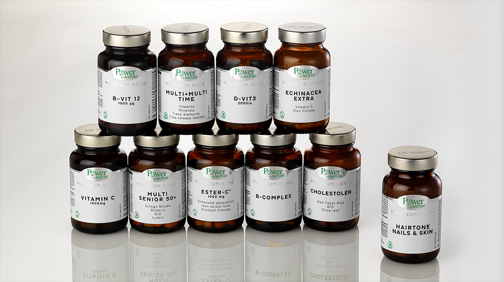
- Packaging
Rebranding for the Platinum Range vitamins of Power of Nature. White space and contemporary typo approach, depict the pure and scientific character of the products. The label is an outcome of white, black and green color, printed on a silver foil. This production technic empowers the scientific character of the iconic brand and gives a stand out appearance on the pharmacy shelf. The new visual system is designed to be applied on 35 labels and more than 20 boxes, keeping the consistency of the identity strong and efficient.
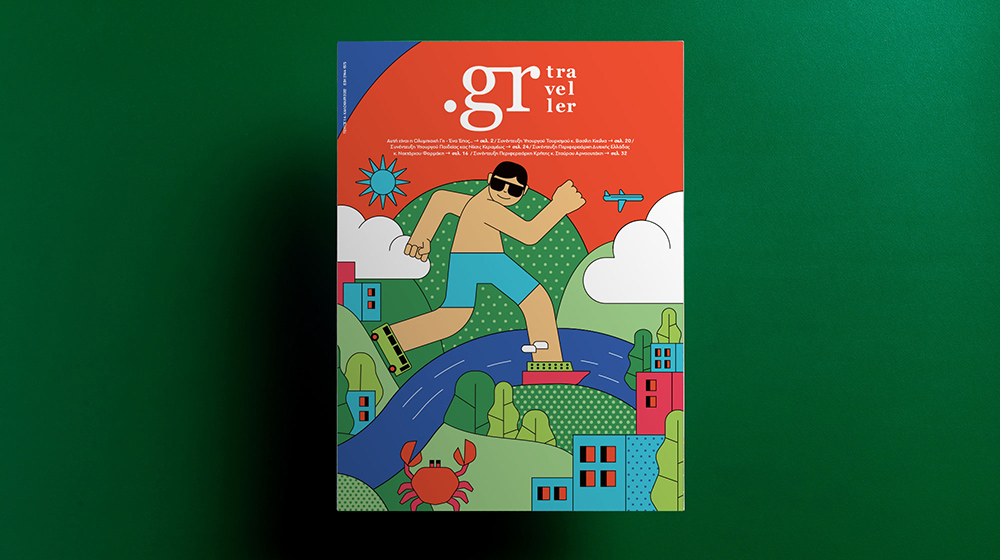
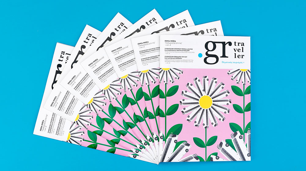
- Free press magazine
Design for travellers free press magazine. The typography interacts with the pages and the content (word & image) and creates an "organic" identity for each unit of the magazine. For the covers, we illustrated our gr traveller figure that interacts with the landscape of Greece. Each cover is a part of a bigger illustration.
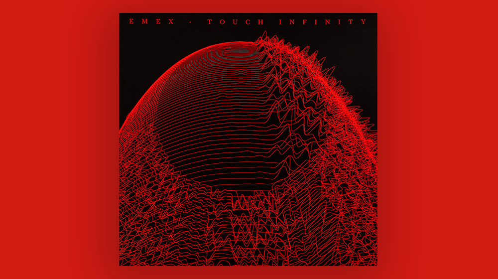
- Vinyl disc cover
The Touch Infinity project involves the creation of works of art based on Spira and the way it is harmonized in modern art, an action with an emphasis on design and contemporary electronic music. We live in a spiral galaxy. The first sensation that a spiral shape gives is the image of evolution and the will to touch the infinity. Modern technology and binary code give us the ability to touch the infinity. With the use of modern technology, the music will be rendered in addition to vinyl in the form of a spiral ceramic vase.
The cover of the vinyl depicts the wireframe created from the music in order to be 3d printed in the form of the unique vase.Artwork: Yiannis Vogdanis / This email address is being protected from spambots. You need JavaScript enabled to view it.
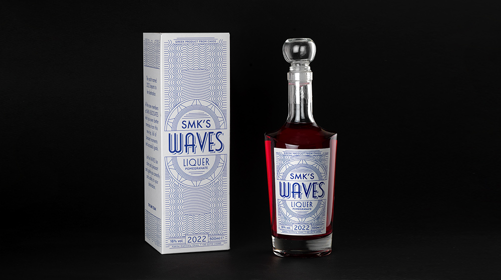
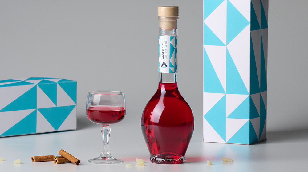
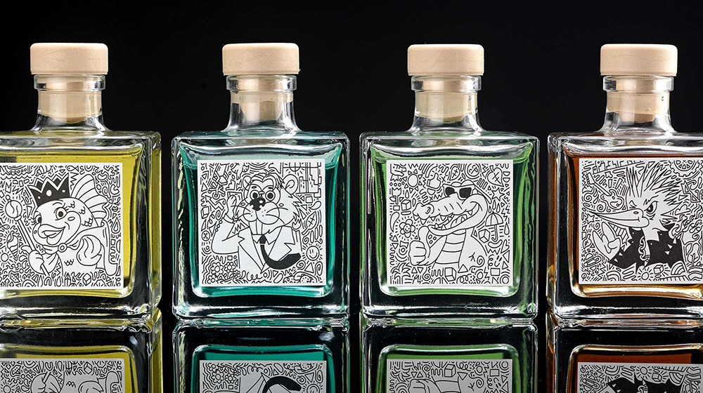
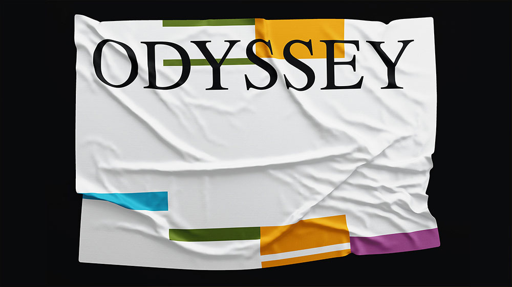
- Packaging
Packaging design of liquer from Chios island, Greece. The composition of different patterns depicts the different waves around the island, while the typographic elements give the character of the liquer's branding.

- Corporate identity
A “non static” Logotype for Angelis Movies LTD, the company of film and television productions based in Athens, Greece. The screen (logotype) acquires the proportions 4:3, 16:9, 21:9 that are used mainly in production formats and other times custom made proportions. Thus, the logo acquires flexibility and variety, and lengthens depending on the needs of each application, creating a dynamic identity and contemporary solutions for many branding applications.
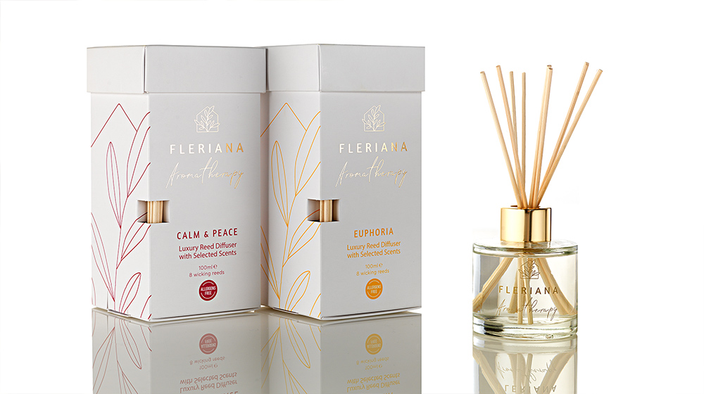
- Packaging
Packaging design and identity for the Aromatherapy range of Fleriana. Aromatic candles, reed diffusers and fabric sprays "spread" nature in your space, home and work. Luxury products based on natural ingredients.
- Home fragnances
“You are holding 221 grams of applied design. The concept, the bottle, the content and the graphics, all came together here in Grams design studio in order to send you our best and creative wishes for 2021.”
The target group: Clients, partners and friends.
What we did: We combined our wishes for the new year (2021) with our work in branding and packaging design. We designed and produced a packaging system of 4 personalised home fragrances.
Τhe insight: One year has past after renaming the design studio to Grams design and we wanted to create a concept that will reflect to our new name. Our main concern was to depict and inform about our specialty: Branding and packaging design services.
The twist: The ml unit is diverted to grams unit adjusted to the year 21.
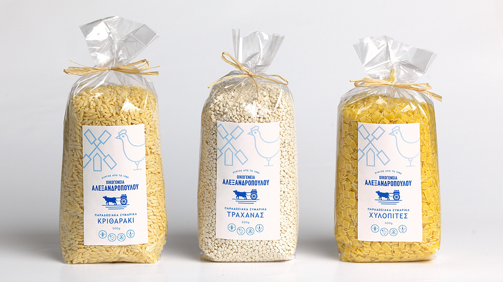
- Pasta packaging
The grandfather of the family traditionally drove the cow with the cart carrying milk to every house in Pyrgos Hleias (Greece). Pure daily milk from the family's cows and sheep. The cow cart becomes a figure of tradition and pure materials. The family's activities also extended to the production of eggs from the hens of the privately owned estate and soon the first pasta was produced with the unique recipe of the grandmother from Smyrna. Flour, milk, eggs and the passion of the Alexandropoulou Family are used in the grandmother's secret traditional recipe and since 1986 the pasta has been making its first appearance on the local market. Respecting tradition since 1986, the Alexandropoulou family has been producing authentic traditional pasta of high quality and nutritional value.
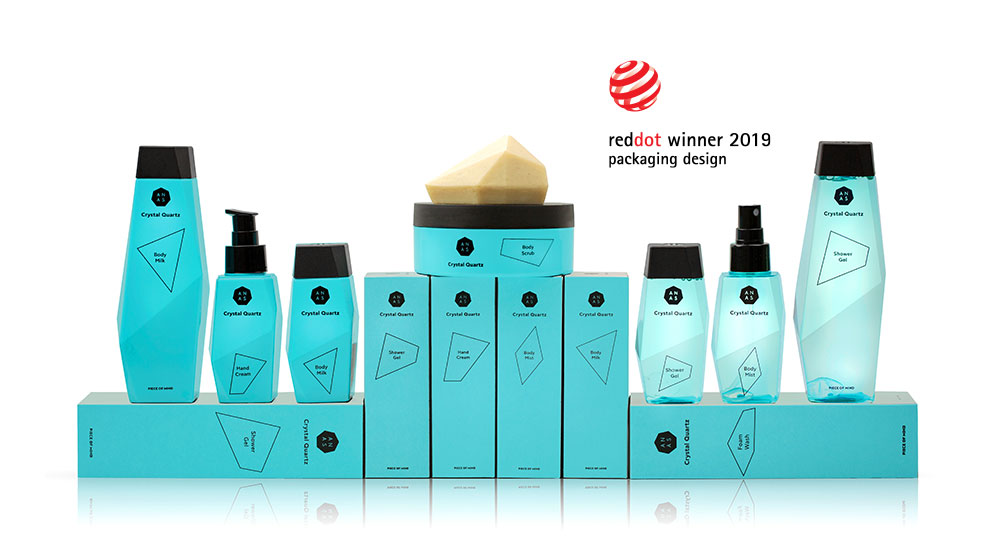
- Cosmetics packaging
ANAS from the Netherlands is the first patented line of cosmetics that uses the powerful properties of crystals by placing a whole piece of natural and refined Crystal Quartz in the heart of its volcanic water based formulas.
We designed a series of packages that have as key ingredient the "crystal", its shape and its characteristics. Our strategy was to invest in every way in the concept of crystal. The uneven shape has led us to think that the packaging itself should be like a crystal for easy recognition by the consumer. Crystal is made up of many small pieces so we visualize each product in the series as a crystalline shape and when all the products come together they create the ANAS logo. Also, we designed the packaging box in such a way that when someone opens it, the product information is gradually revealed. The chosen color, light blue-turquoise brings peace to the eye, as well as the positioning “peace of mind” becomes “piece of mind” in order for the branding to complete.
- Experimental project
Homer’s Blocks of Color is an exploration of different ways to chart a story visually. For this study, we referenced Homer’s two most iconic books, not only due to the plurality in characters and plot, but also due to the divine element in the narration.
The exploration led us to develop a visual system based on three basic guides.
For Guide 1 we capture the timeline of the novel – in this case, the days on which the narration of each book takes place. (y axis of the chart)
For Guide 2 we select characters who play a leading role in the development of the story, as well as things and incidents that affect them. After that we define one color block for each. (x axis of the chart)
For Guide 3 we place each character, thing or incident on the story’s timeline and match them in relevant combinations. (chart bars)
The outcome is a system that generates graphics based on the plot of each book. The system can generate visuals that can be applied on posters of theatrical plays, on covers of new books based on Homer’s work, on product labels and more. The method of this system is dynamic, making it applicable to other novels and books based on their unique content.
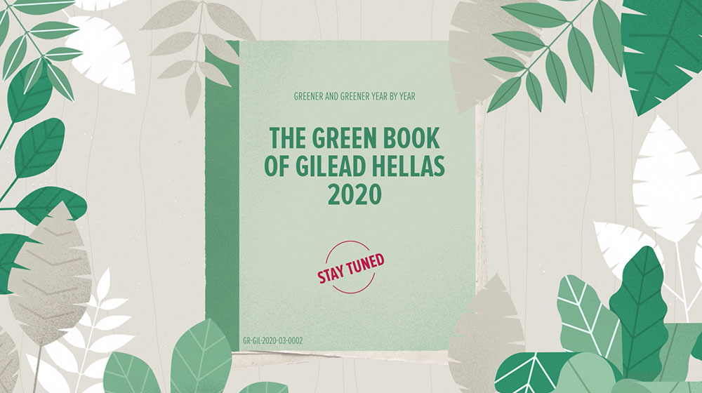
- Animation
In the beginning of 2020, we undertook the production of Gilead's internal communication. The whole project included the concept creation, the script, the graphic system, the animation and finally the creation of a two-minute video. Our concept, “The Green Book”, explains and reveals, page by page the ecological footprint of Gilead. The pages come to life through custom and branded animated graphics and clear information in a combination of form and image. Many thanks tο all the team #copywriter #illustration #animation #sounddesign
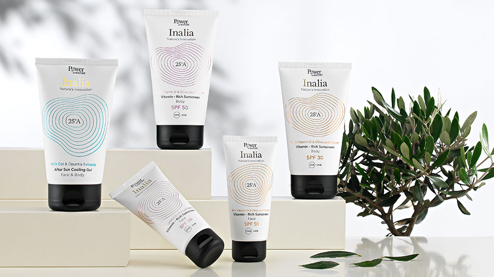
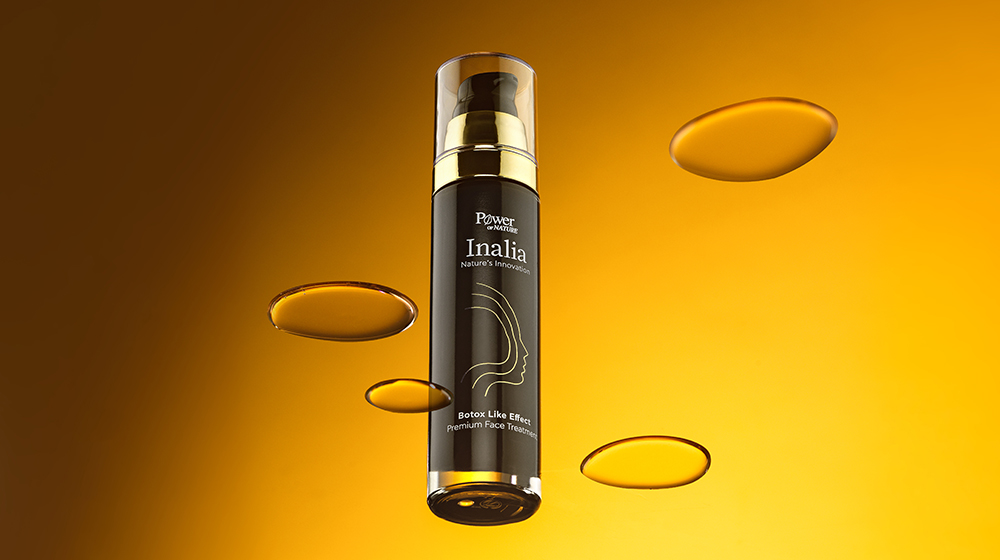
- Face & body cream packaging
We were assigned by Powerhealth, one of the largest vitamin companies in Greece, to design the package for its first suncare series. Our name proposal was “Inalia”, one of Aphrodite's names - the goddess of beauty - in ancient Greece. The topography and the altitude difference of the fertile soil of Crete were the inspiration for the creation of the series' visual mechanism. Concentrated shapes and curves demonstrate the altitude difference and also the way Nature's Innovation spreads to the skin, while white in combination with metallic colors enforces the scientific character of the products.
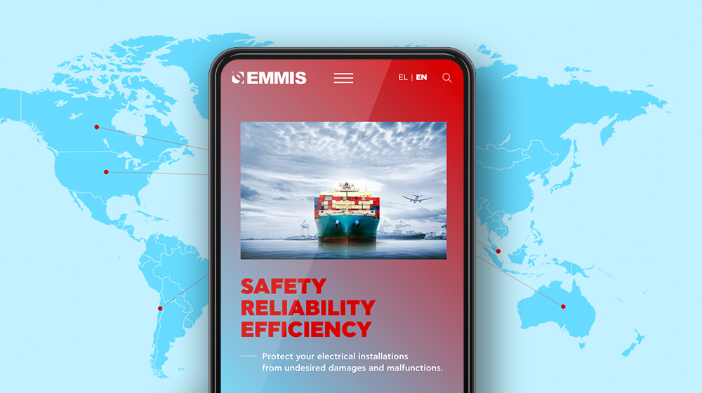
- Website
Web design for EMMIS SA, a company that manufactures transformers for global industries.
Products, solutions, applications, key selling points, strategic advantages and the new strategic positioning EMMIS SA are studied and transformed into graphics, typography, images, colors and illustrations, all combined to reflect the specialised and strong export character of the company.

- Animated campaign
As part of a campaign against depression and other mental disorders caused by alcohol, we created 2 videos for Lunndbeck.
Each of the videos describes a typical day in the patient's life.
Credits: Creative Direction & Production Overview: Spyros Grammenos & Christos Papavasileiou / Illustrations & Art Direction: Farawayfarers.studio / Animation: Alexandros Pyrenis / Sound: Musou Music Group
- Corporate identity
The new Logo for an orthopedic clinic that deals with the treatment of bones-joints diseases and injuries. TOC is made from the initial letters of the clinic Total Ortho Care. Dynamic and Organic combination of typography. Capturing the joints and the movement of the human’s body limbs. The logo's flexibility is depicting the recovered movement after surgery. Dynamic implementations in every piece of content of the brand identity. Memorable, Unique, Campaignable.
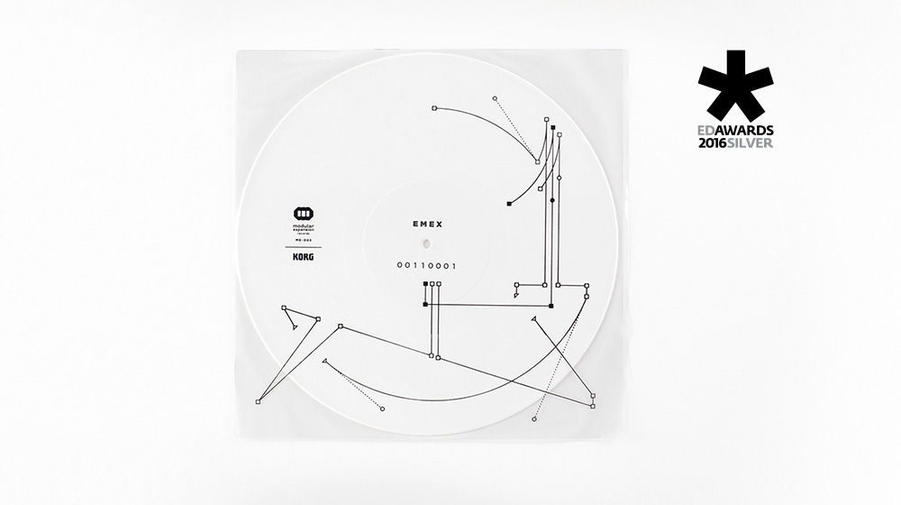
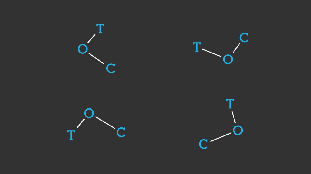
- Vinyl disc cover

Cover design and visual mechanism for Modular Expansion records. The vinyl record of EMEX is inspired by mathematics and digital electronics. The design, minimal and encoded, follows the conceptual fusion of dancefloor techno and atmospheric overtones. Designing a continues visual system that generates different graphics by following the above three rules: 1. The squares are the nodes and two ends create a straight line / 2.The triangles are the half parts of the node, so one continues the route of the other / 3. Circles are the levers that create the curves. Designing a continues visual system that generates different graphics.
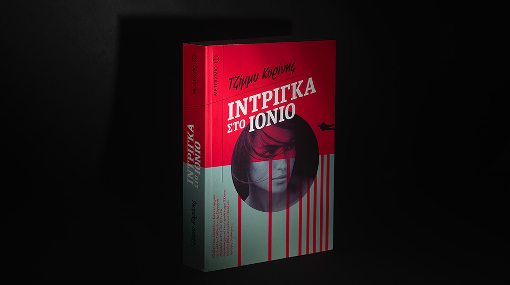
- Book covers
Designing covers for the Greek crime series of METAIXMIO publications. Forms - images and typography capture the style of each book.
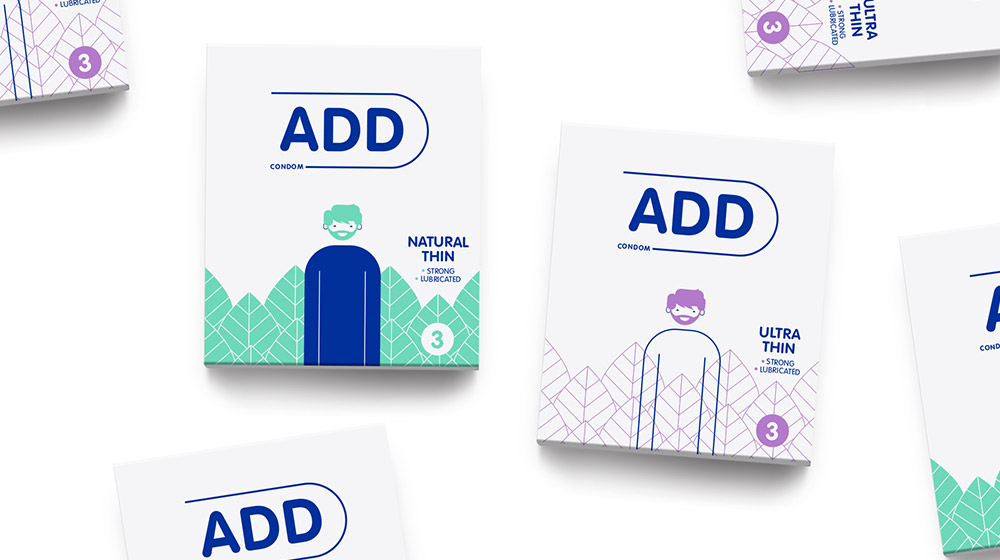
- Branding & packaging
To design a condom packaging, you have to be bold, speak to youthful codes, be up-to-date, but also differentiate yourself from the usual competition that has prevailed in Greece in recent decades.
So we chose white as the primary color and differentiated ourselves from the color codes of the competition. Then, we created an avatar hero, who wears a different outfit in each package and is the main visual mechanism. The outfit represents the type of condom contained in the package. Correspondingly, the condom name becomes part of the package and thus the word ADD is complemented each time by the positioning of each condom style (e.g. ADD Safe Sex, ADD Real Touch...). In this way, we created a system of word and image which can be developed further into subsequent types of condoms. For example, by changing the outfit to a jacket, we can talk about a thicker condom e.t.c.
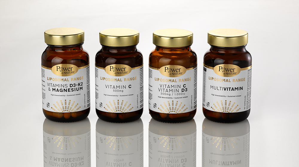
- Packaging
Liposomal technology gives vitamins, minerals and trace elements high stability and bioavailability, protecting them from enzymatic degradation during their stay and passage through the digestive system. This ensures slow and prolonged release in the body. The label design depicts the liposomal ring, while the white space and contemporary typo approach depict the pure and scientific character of the products. White and black print on gold foil gives a premium scientific touch that stands out on the pharmacy shelf.
- Wall calendar
Greek songs from the movies are depicted with frame illustrations. Experimenting illustration technics for the annual concept of 2019’s printed calendar.
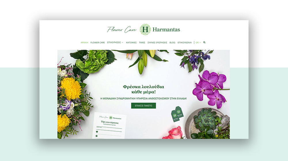
- Website
Along with the new brand identity of Harmantas Flower Creations we were assigned to design and study the new service website: Harmantas Floral Creations brings nature to your place, home or business.
With fine floral creations, made with passion and love by specialized award-winning floral designers. Without you having to worry about purchasing flowers, or their upkeep and replacement, or else “fresh flowers every day”.
Friendly and flourish UIX based on a design study of branded photography, color palette, typography and graphics. See the website here.
- Free press
Μagazine design for the first ever freepress magazine of intercity buses in Greece. Audience of magazine: travellers all around Greece who use the intercity buses. Content of magazine: depending on the season, the news and the destination of cities and islands.
- Website
ANAS from the Netherlands is the first patented line of cosmetics that uses the powerful properties of crystals by placing a whole piece of natural and refined Crystal Quartz in the heart of its volcanic water based formulas.
The packaging that we designed has as key ingredient the "crystal", its shape and its characteristics, so our web design study was based on the same principles. Crystal shape forms, ANAS color palette and products unlock the user's interface experience.
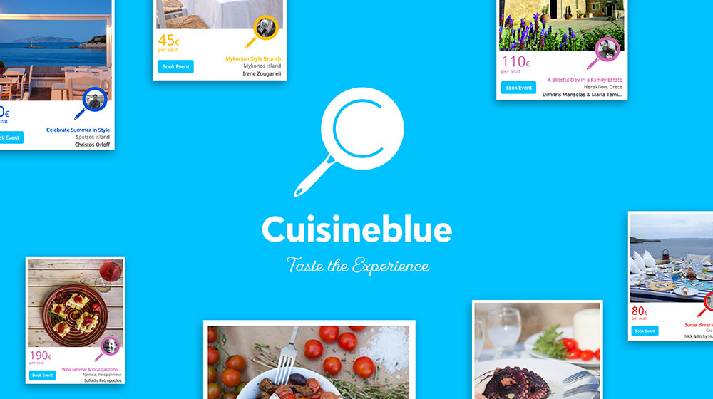
- Web platform
Cuisineblue is the booking platform for genuinely authentic dining and cultural experiences in Greece, offered by locals. For the launch of this platform, we were assigned to design the logo and visual identity of the brand. We came up with a simple but memorable idea. Α pan transformed into the symbol of searching: a magnifying glass and became blue, following the name of the brand (Cuisineblue) ang of course its Greek origins. You can see the platform here.
- Wall calendar
Each month of 2016 represents a classic Greek song. Illustrate and experiment on textures in order to create a solid contemporary project based on Greek song history. Concept and design for 2016’s wall calendar and digital posts.

- Website & illustrations
For Nikou Edu, a model foreign language school, we had to create a visual identity along with digital visuals for its website and social media. So, we designed witty and friendly custom illustrations for every service of the school. Different illustrations for every class, for every tip on the website and even more illustrations for the social media. The color palette of the illustrations was picked from the schools logo and the illustrations depicted happy students, parents and teachers in a very friendly environment. You can visit the website here.
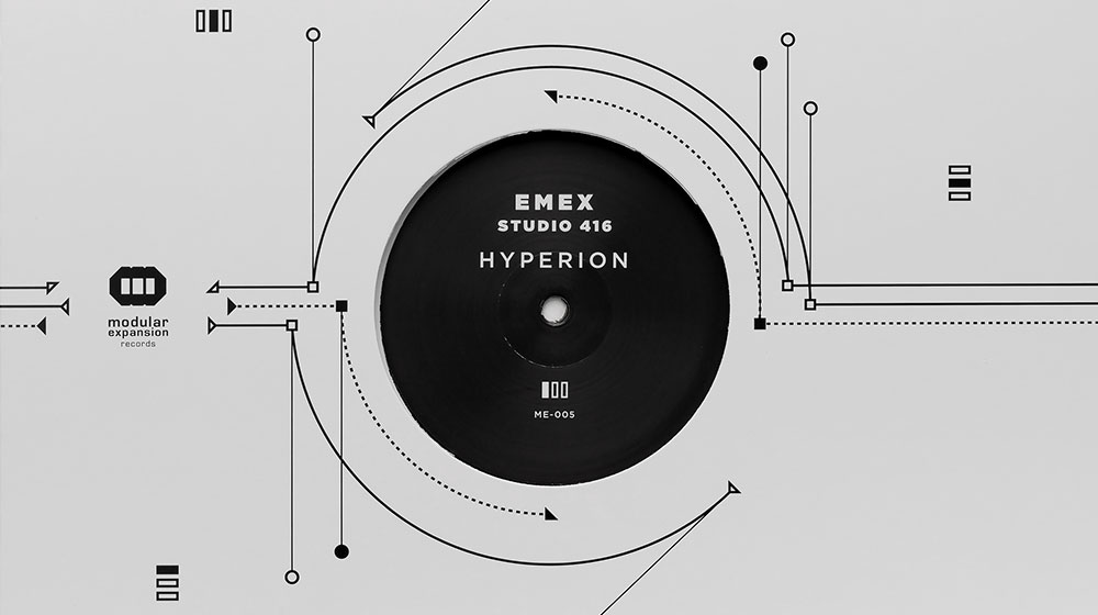
- Vinyl disc cover
Visual depiction of the planet Hyrerion (Yperiona) on the cover of the album of EMEX and STUDIO 416. Techno music is visualized by the visual mechanism designed for Modular Expansion Records: 1. The squares are the nodes / 2.The triangles are the half parts of a node, so one continues the route of the other / 3. Circles are the levers that create the curves. Designing a continues visual system that generates different graphics.
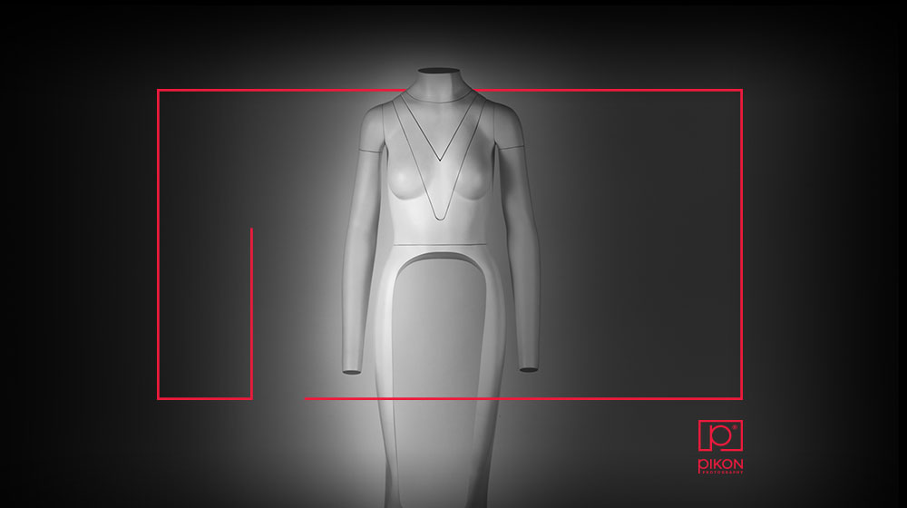
- Corporate identity
Logo design and corporate applications for Pikon Photography. The archigram of Pikon, becomes the frame and the camera itself. The feature of the logo is the key element in all the applications. Flexibility and storytelling comes out of a single mark.

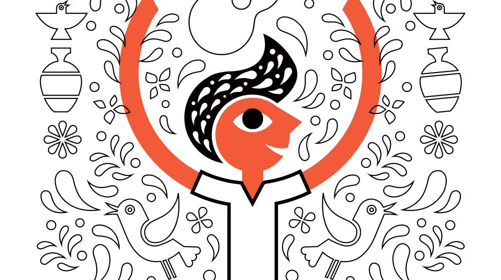
- Wall calendar
Random Greek songs are depicted with random illustration technics, in random pages of a random project. Experimenting “the random” by illustrating 2018’s wall calendar.
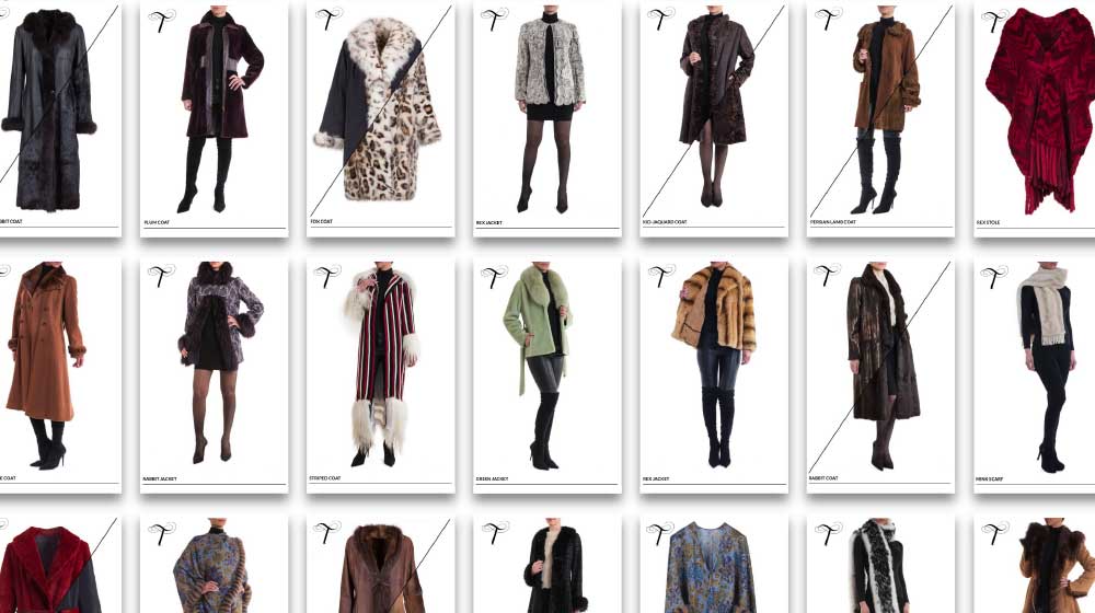
- Rebranding
For the historic fur house “Toutountzi” based in Athens, we were assigned to revamp their visual communication. Our main design vehicle was the letter T and we designed the logo and identity based on the brand’s 3 values: Classic, Unique, Handmade. The logo implemented in different formats and materials and became a very memorable asset for the company's visual communication.
- Wall calendar
Each month of 2017 represents a traditional Greek song. Illustrating on white camvas in order to create a solid annual project based on Greek song tradition for 2017’s print calendar and digital animated posts.