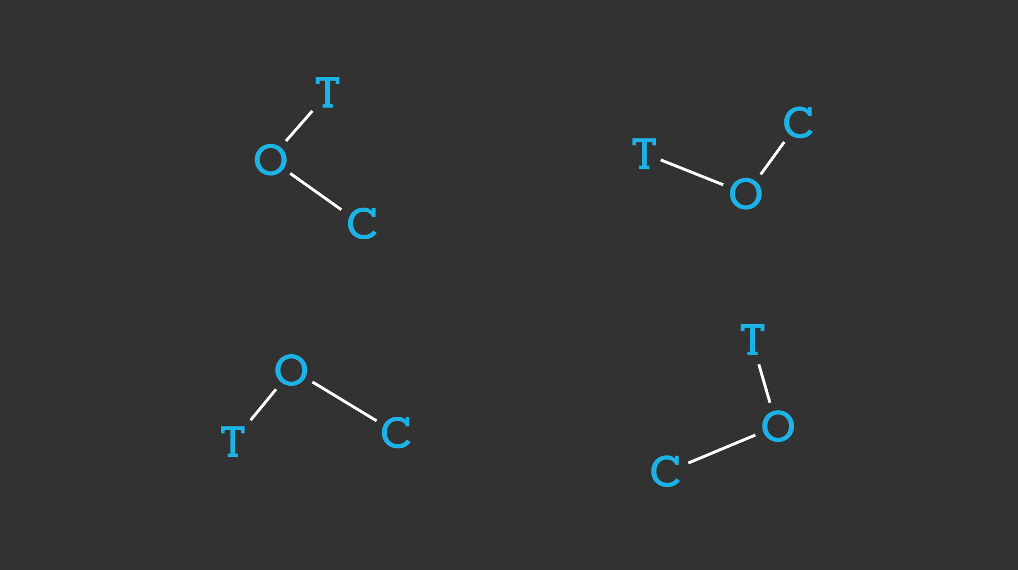

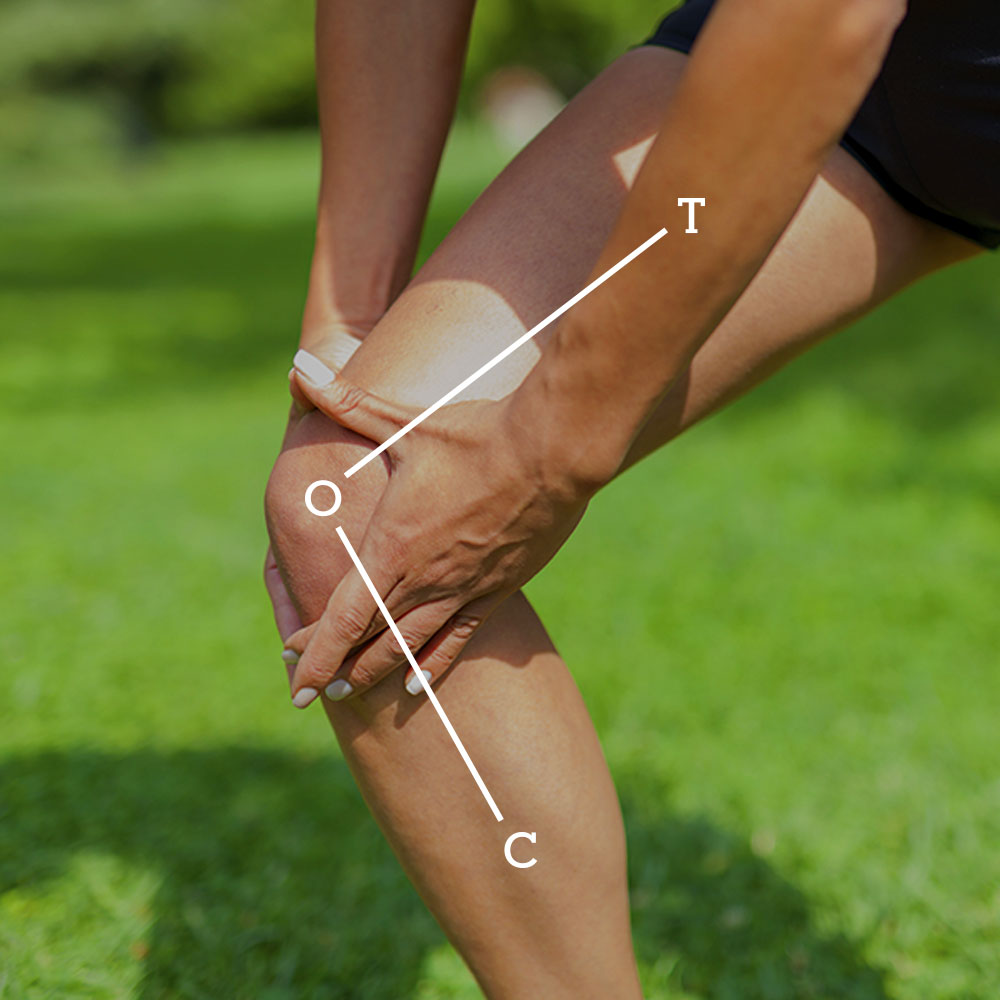
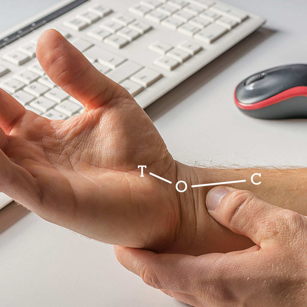

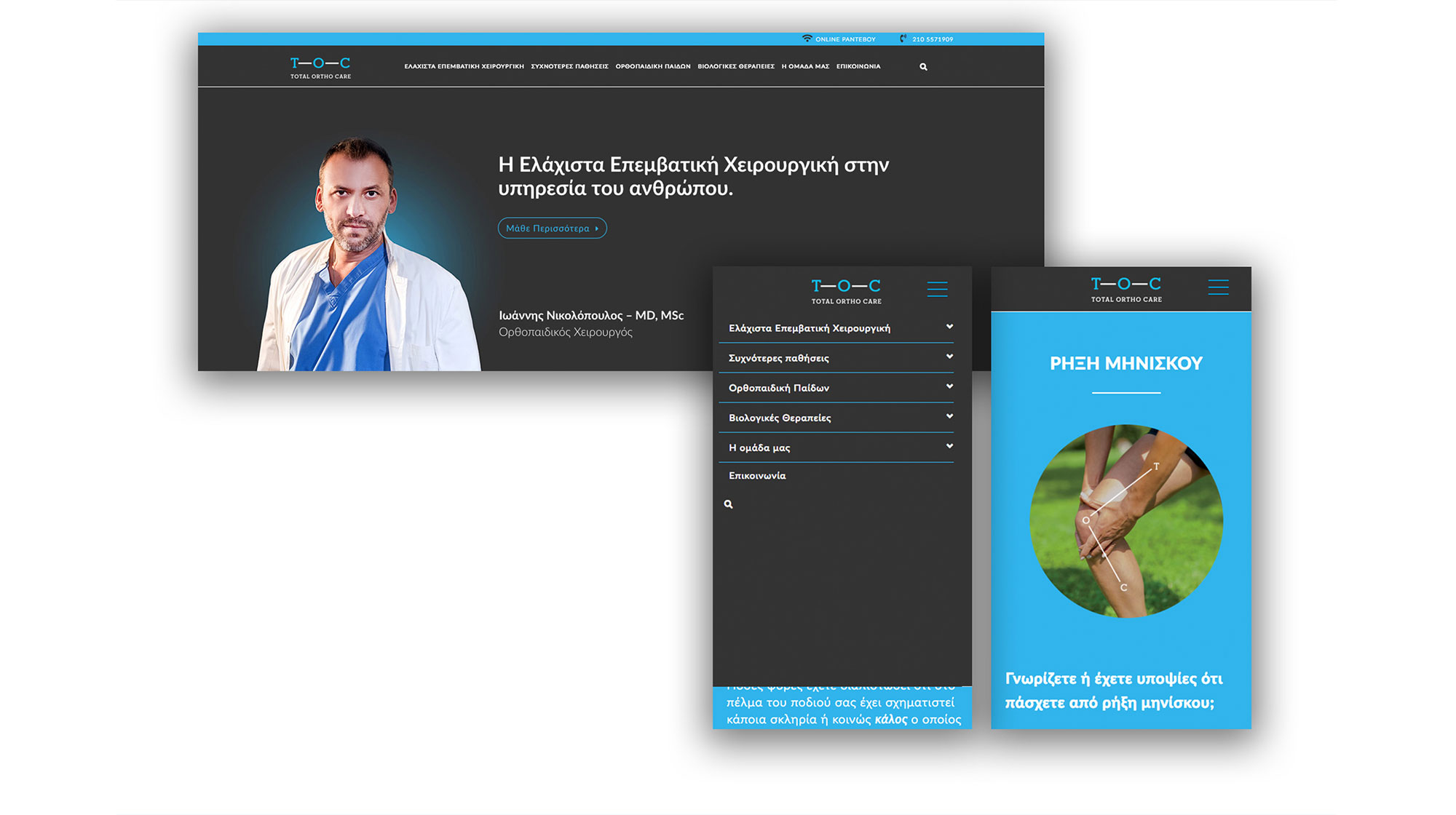
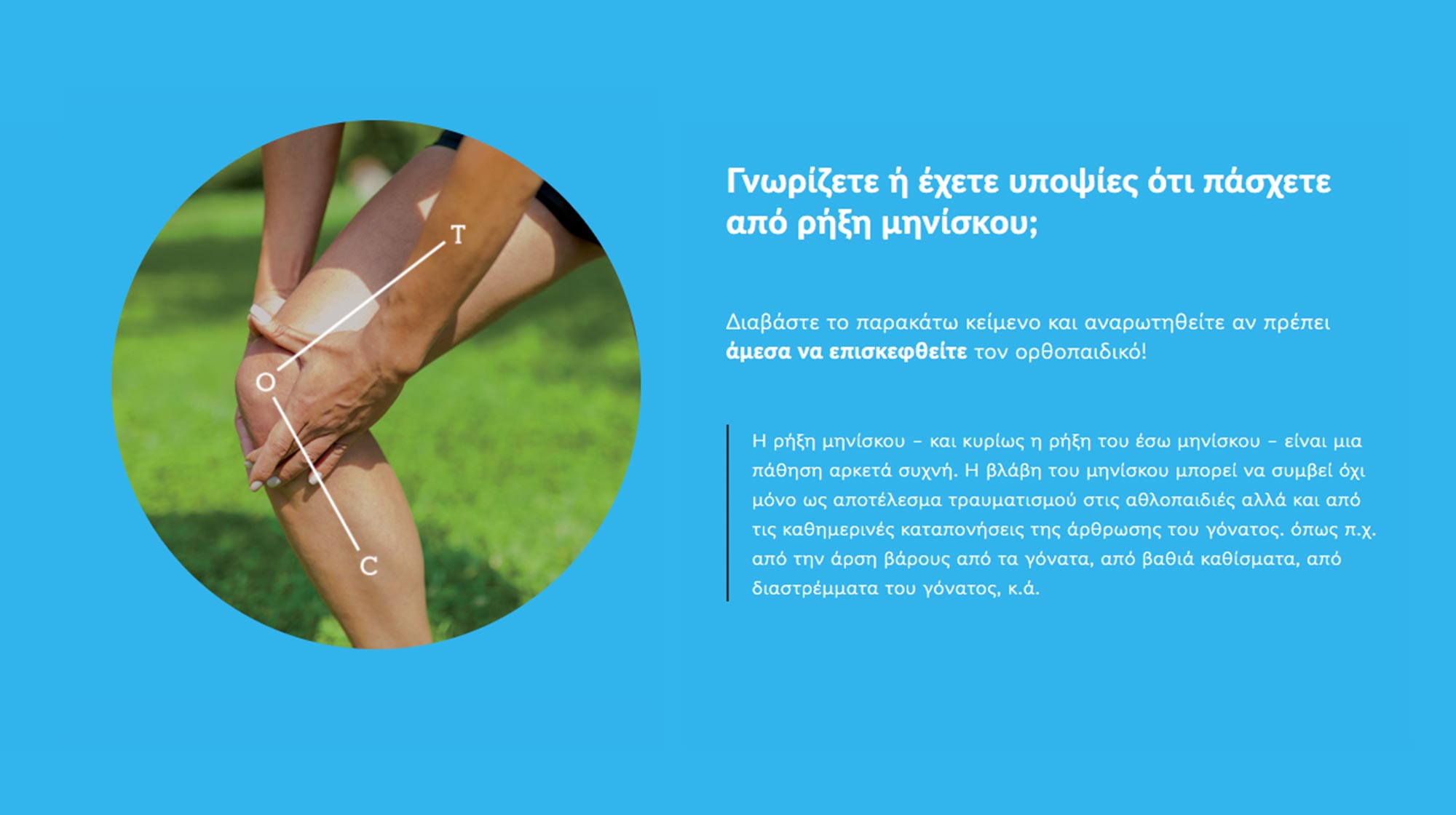
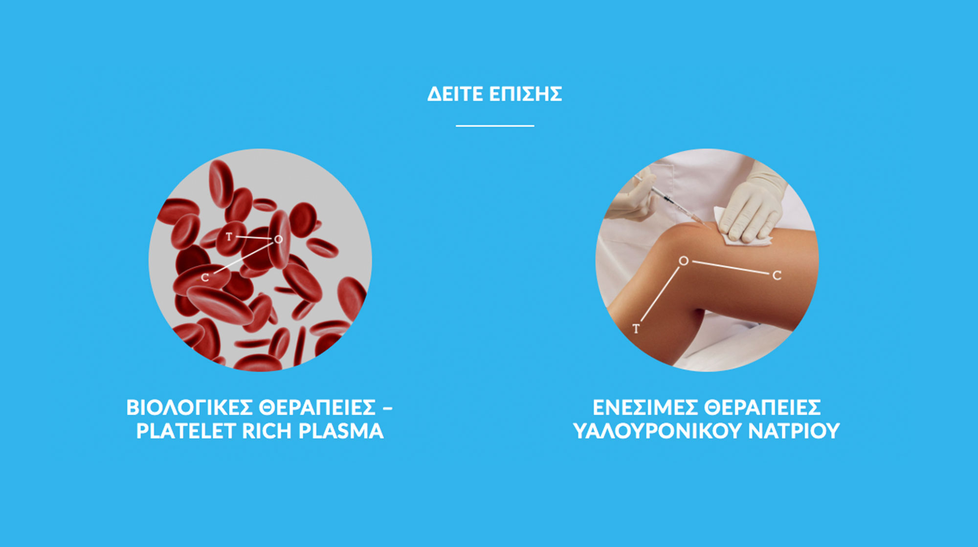
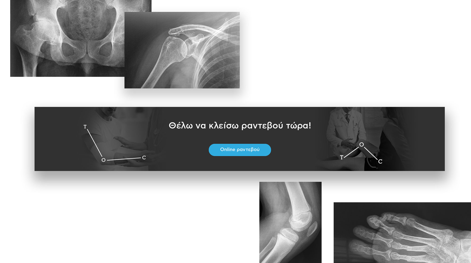
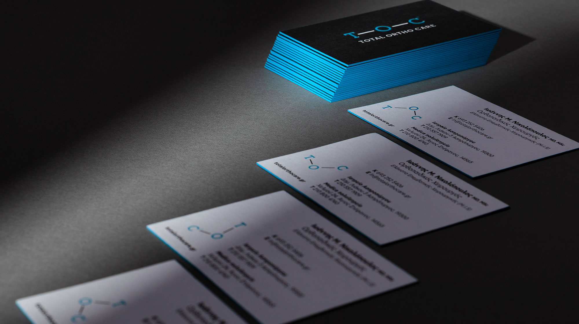
The new Logo for an orthopedic clinic that deals with the treatment of bones-joints diseases and injuries. TOC is made from the initial letters of the clinic Total Ortho Care. Dynamic and Organic combination of typography. Capturing the joints and the movement of the human’s body limbs. The logo's flexibility is depicting the recovered movement after surgery. Dynamic implementations in every piece of content of the brand identity. Memorable, Unique, Campaignable.