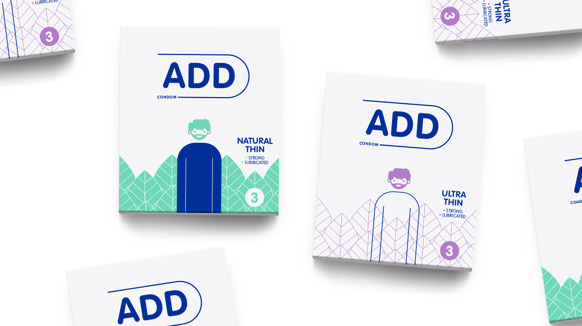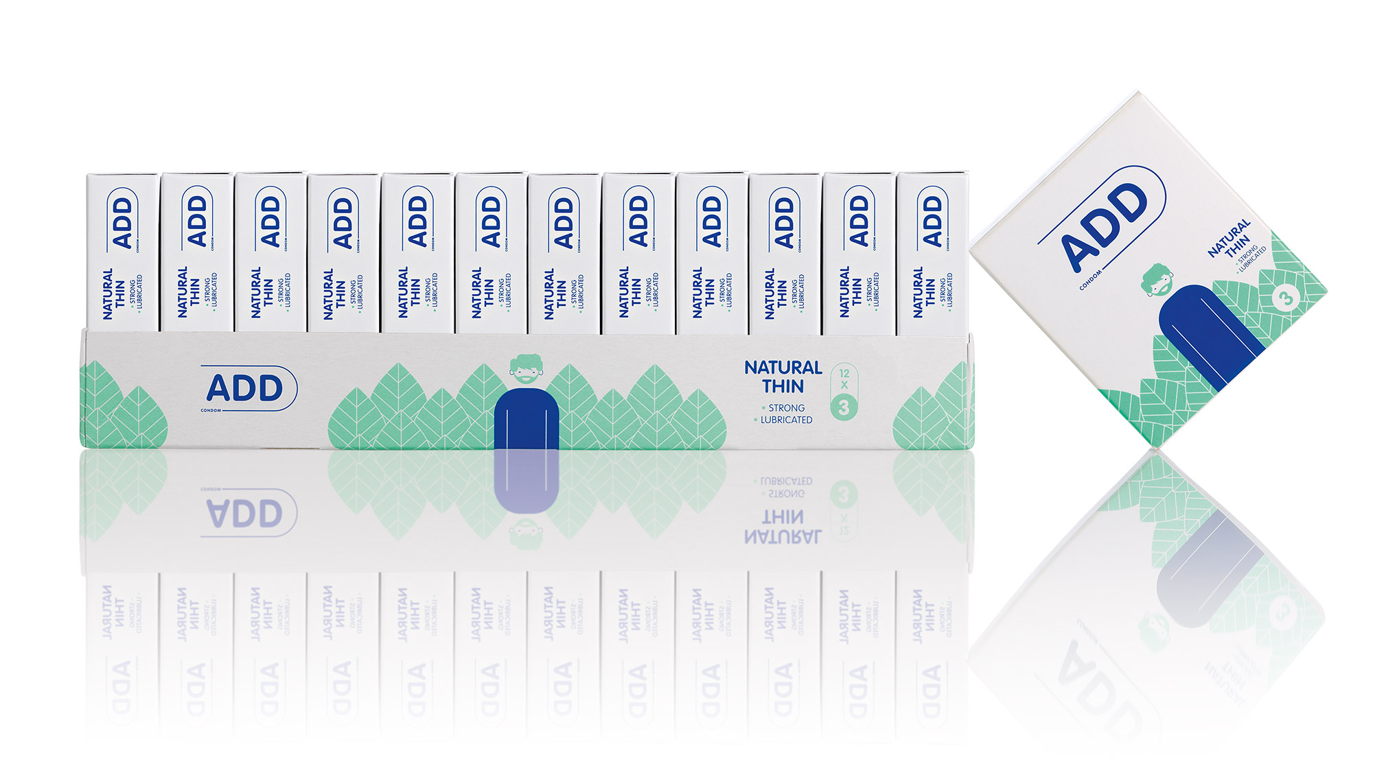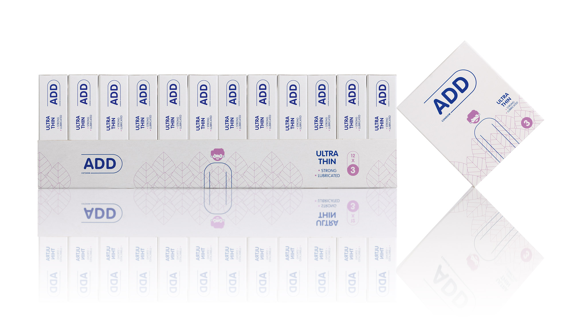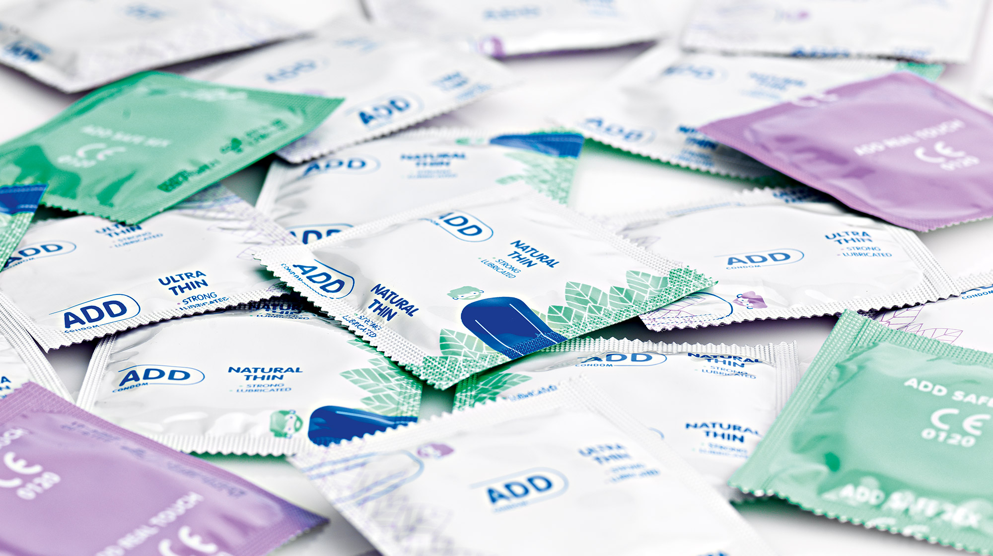


To design a condom packaging, you have to be bold, speak to youthful codes, be up-to-date, but also differentiate yourself from the usual competition that has prevailed in Greece in recent decades.
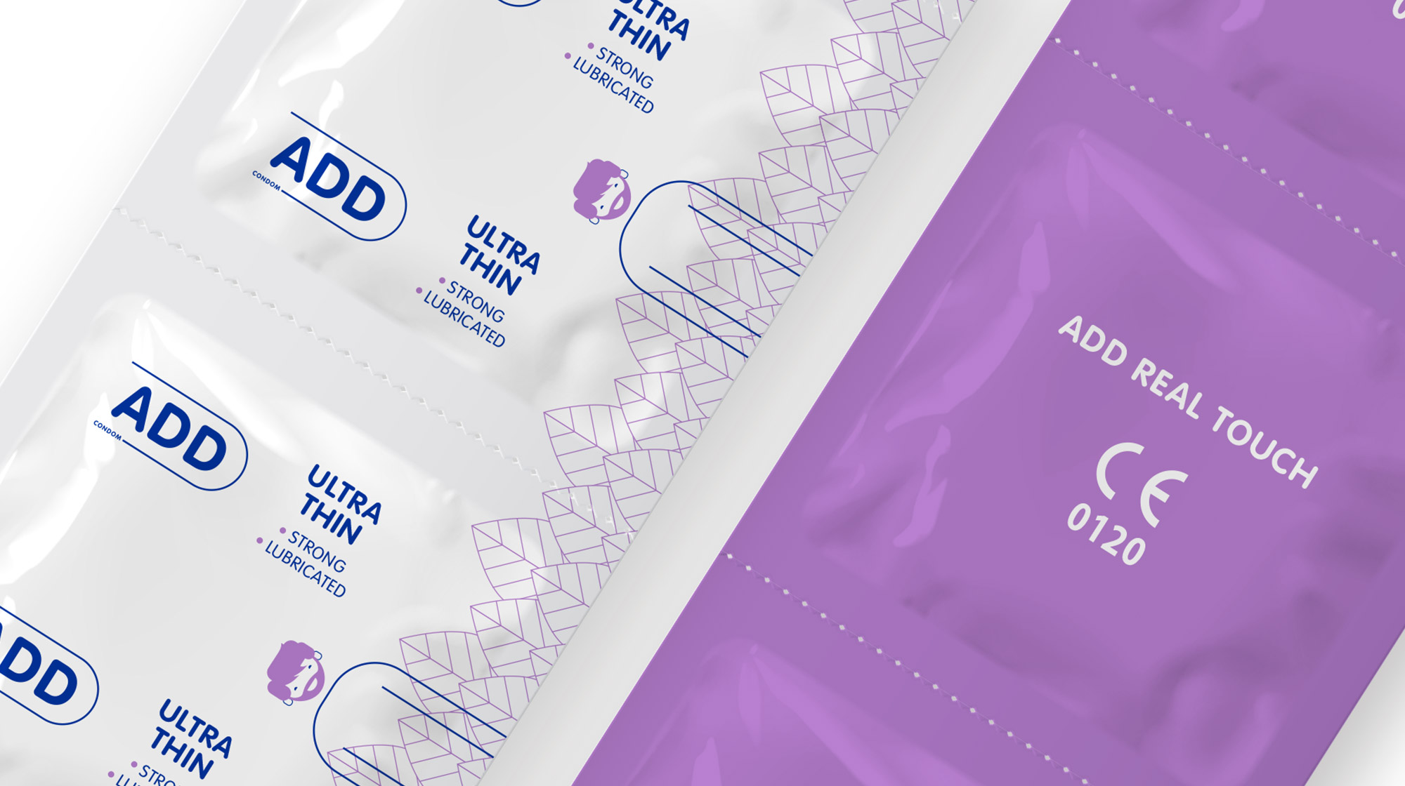
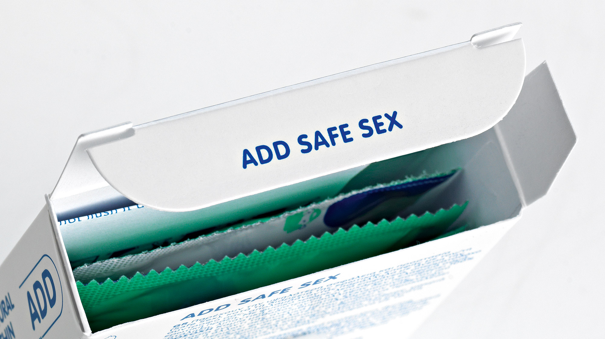
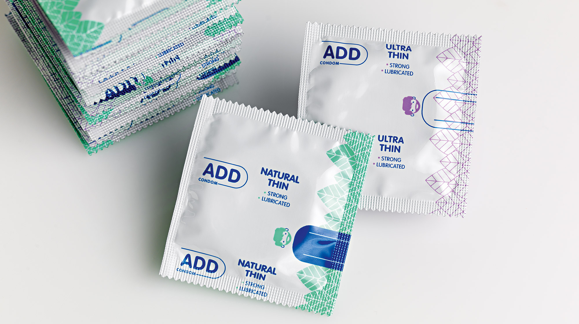
So we chose white as the primary color and differentiated ourselves from the color codes of the competition. Then, we created an avatar hero, who wears a different outfit in each package and is the main visual mechanism. The outfit represents the type of condom contained in the package. Correspondingly, the condom name becomes part of the package and thus the word ADD is complemented each time by the positioning of each condom style (e.g. ADD Safe Sex, ADD Real Touch...). In this way, we created a system of word and image which can be developed further into subsequent types of condoms. For example, by changing the outfit to a jacket, we can talk about a thicker condom e.t.c.
